
Many plots, little time
An agent may visit several farms and samples in one day.
Design response
A route-led home screen keeps today’s work and pending tests close.

An agricultural field-testing app UX case study: I designed a mobile workflow for agents to verify plots, capture potato quality samples, and recover offline.
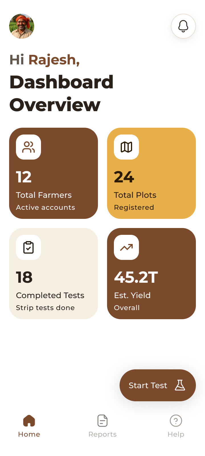
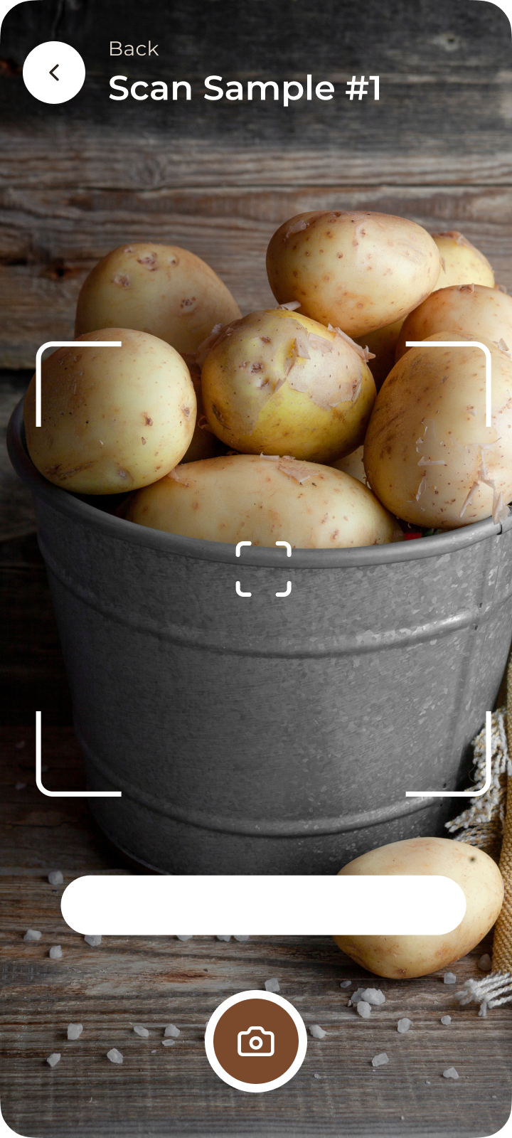
Manual potato quality checks across large fields are slow, inconsistent, and prone to capture errors. That uncertainty flows into pricing and yield decisions, so the product needed to make each test easier to perform and easier to trust—without inventing certainty where field conditions make it impossible.
The primary user manages a changing set of farmers and plots, works outdoors, and often arrives with weak signal or uncertain GPS. The dashboard reduces the mental load: what is next, what is pending, and what is safely saved.
The direction came from stakeholder conversations that captured notes about current field checks, offline work, and report sharing. I treated those notes as working hypotheses, translated them into design changes, and kept the gaps visible for later validation.
An agent may visit several farms and samples in one day.
A route-led home screen keeps today’s work and pending tests close.
Coverage can disappear at the exact point of capture.
Local save states and explicit sync language preserve momentum.
GPS is useful evidence, but field boundaries and accuracy vary.
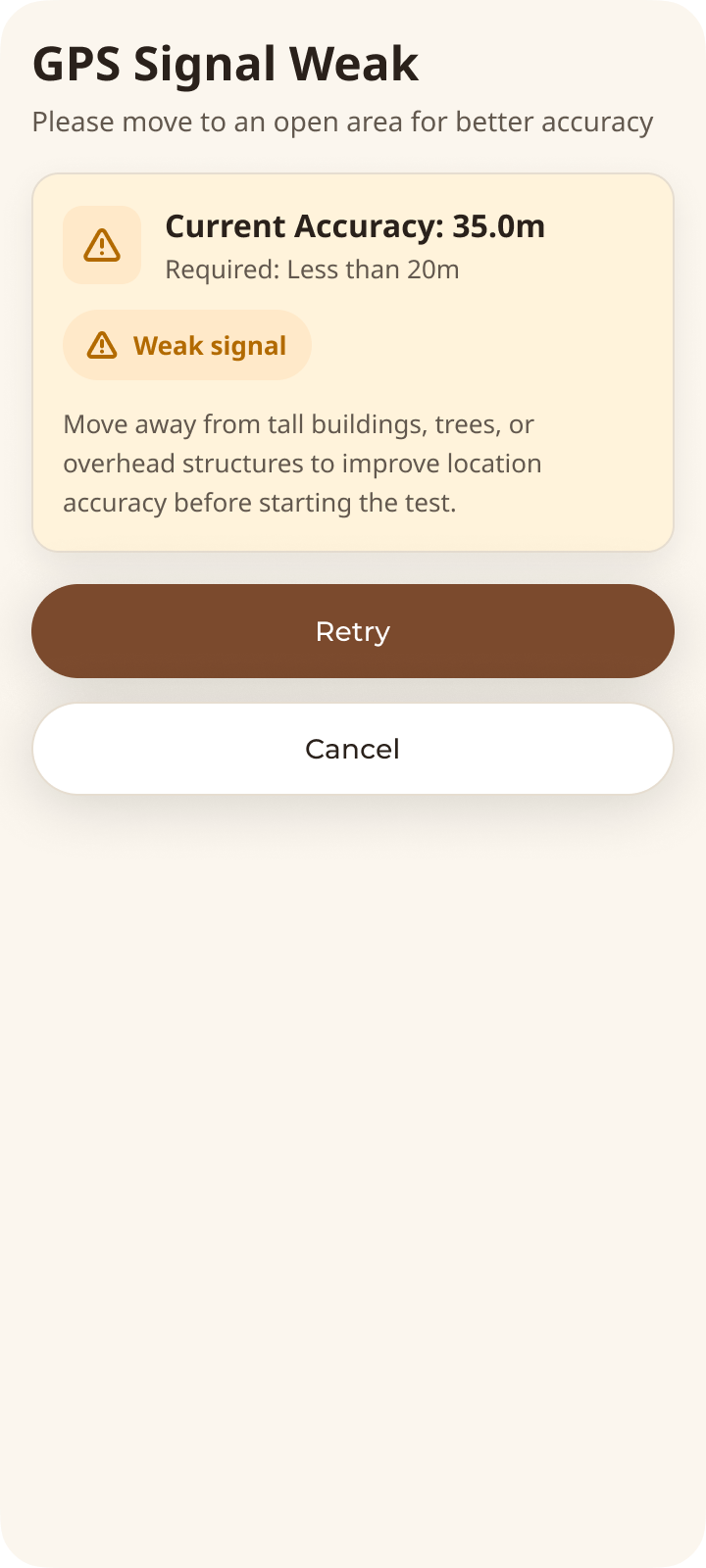
Show accuracy, explain uncertainty, and offer a humane retry.
Every interaction had to earn its place against these constraints.
One primary action per state. Supporting information stays quiet until it is useful.
Plot, sample and result remain visibly connected throughout the workflow.
Location, save and sync status are explicit so the agent can act with confidence.
The flow compresses an operational task into a small number of confident hand-offs: identify, verify, capture, review, submit. Captions focus on what each chapter gives the agent, not on the feature inventory.
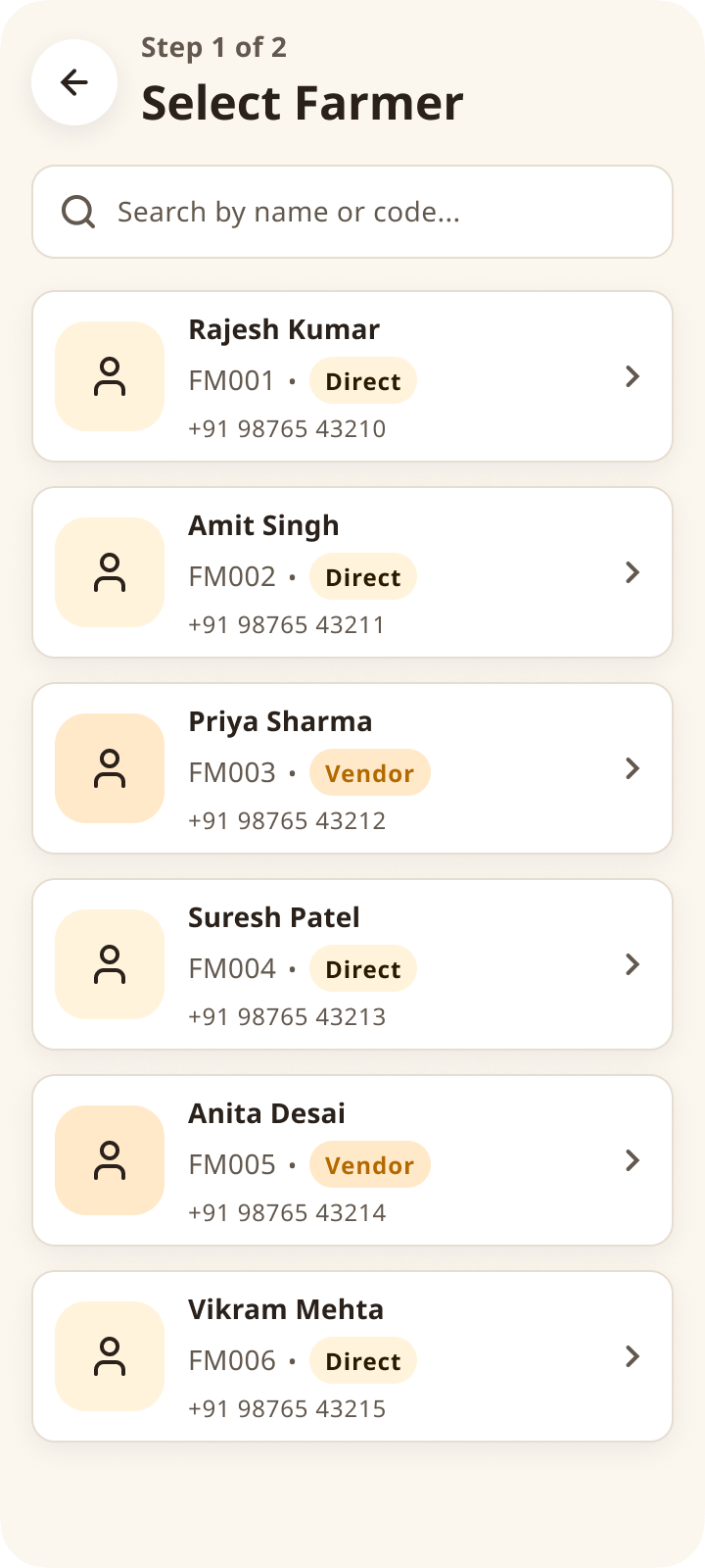
Start with the right plot and enough context to trust what comes next.
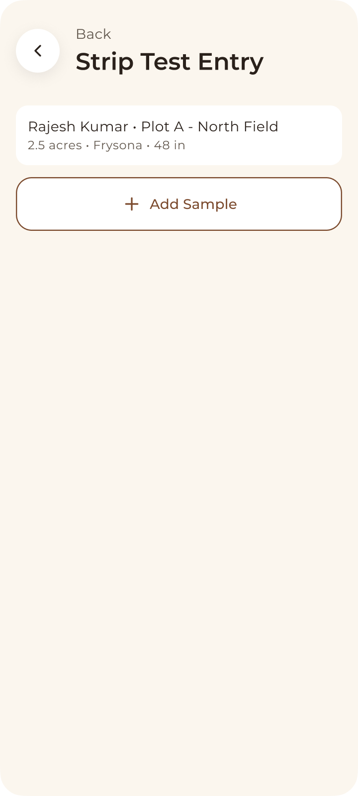
Guide the sample in context without turning the field task into data entry.
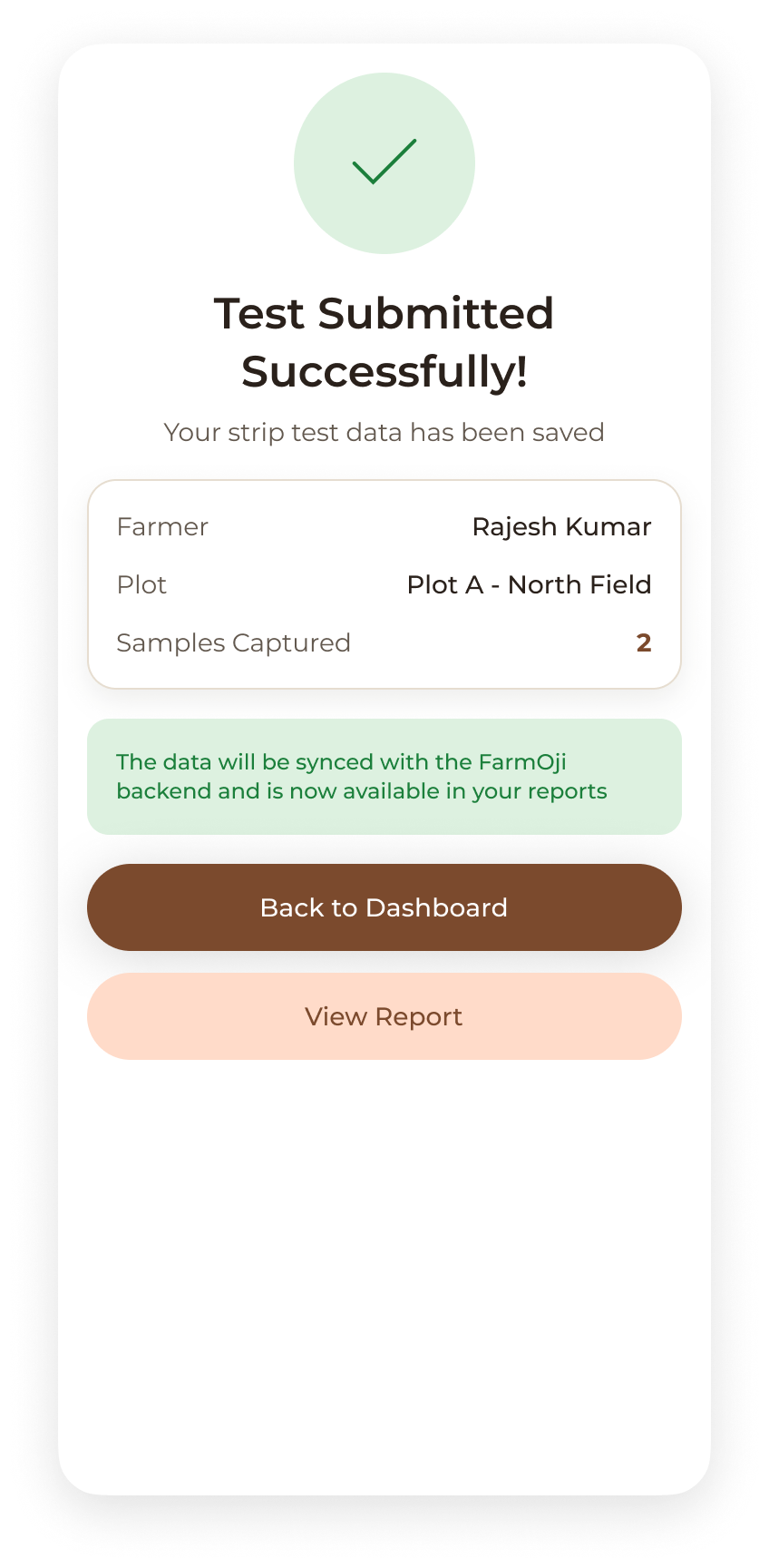
Review the field record while the sample and location are still fresh.
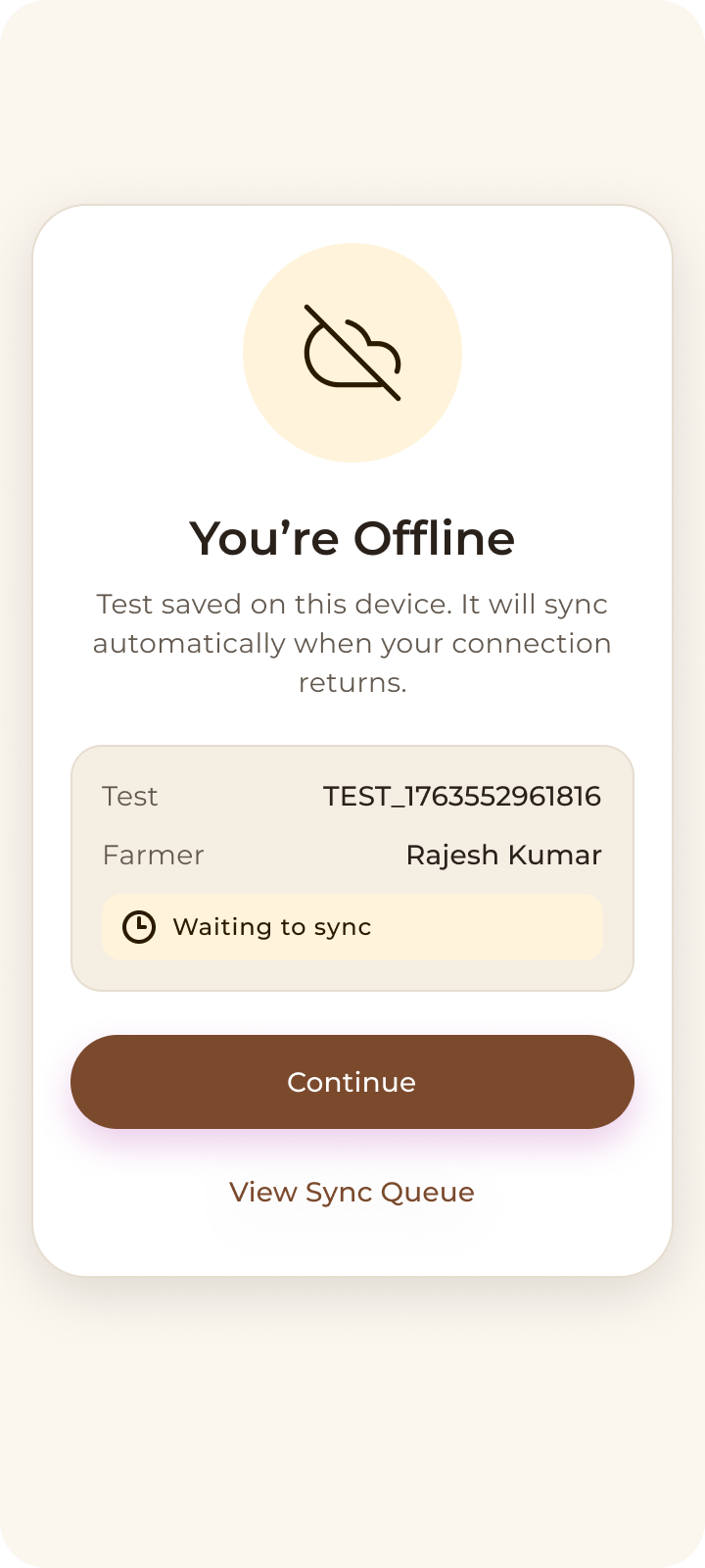
Protect progress when signal drops. Make status legible and the next action credible.
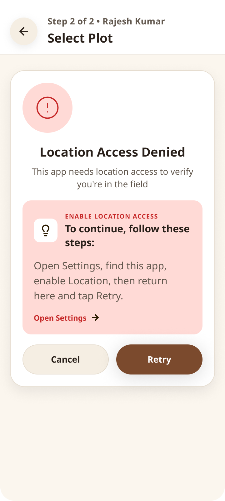
Field tools are judged at their edges. These states make the problem legible, preserve work where possible, and give one credible next step.
Show current accuracy and let the agent retry from a better position.
Explain the boundary clearly before asking the agent to move.
Continue safely and label what will sync later.
Keep the sample and ask only for the image that needs replacing.
Preserve the report and offer one credible retry action.
That gate protects the integrity of the record, but it adds friction at exactly the moment an agent wants to move. The answer was not to remove the check; it was to make uncertainty understandable and recovery humane.
The principle: protect the record without punishing the person doing the work.
A restrained russet palette carries actions and hierarchy; Noto Sans keeps the interface plainspoken and readable. Green is reserved only for good results and confirmed success.
Russet leads action and focus. Cream and ink carry structure. Green communicates confirmed success only.
Plainspoken labels, generous line height, and strong numeric states remain readable outdoors.
The product enables an agent to identify the right field context, capture consistent samples, preserve work through connectivity gaps, and leave with a traceable report. This is a designed capability—not a claim of measured impact.
A clear path from assigned plot to a saved, traceable field record.
Speed, completion rate and error reduction still require field validation.
GPS recovery language, sample guidance and hand-off into report sharing.
This case study describes designed capability—not measured impact.
A secondary map of the Section 1 screen set, recreated with identifying content removed.